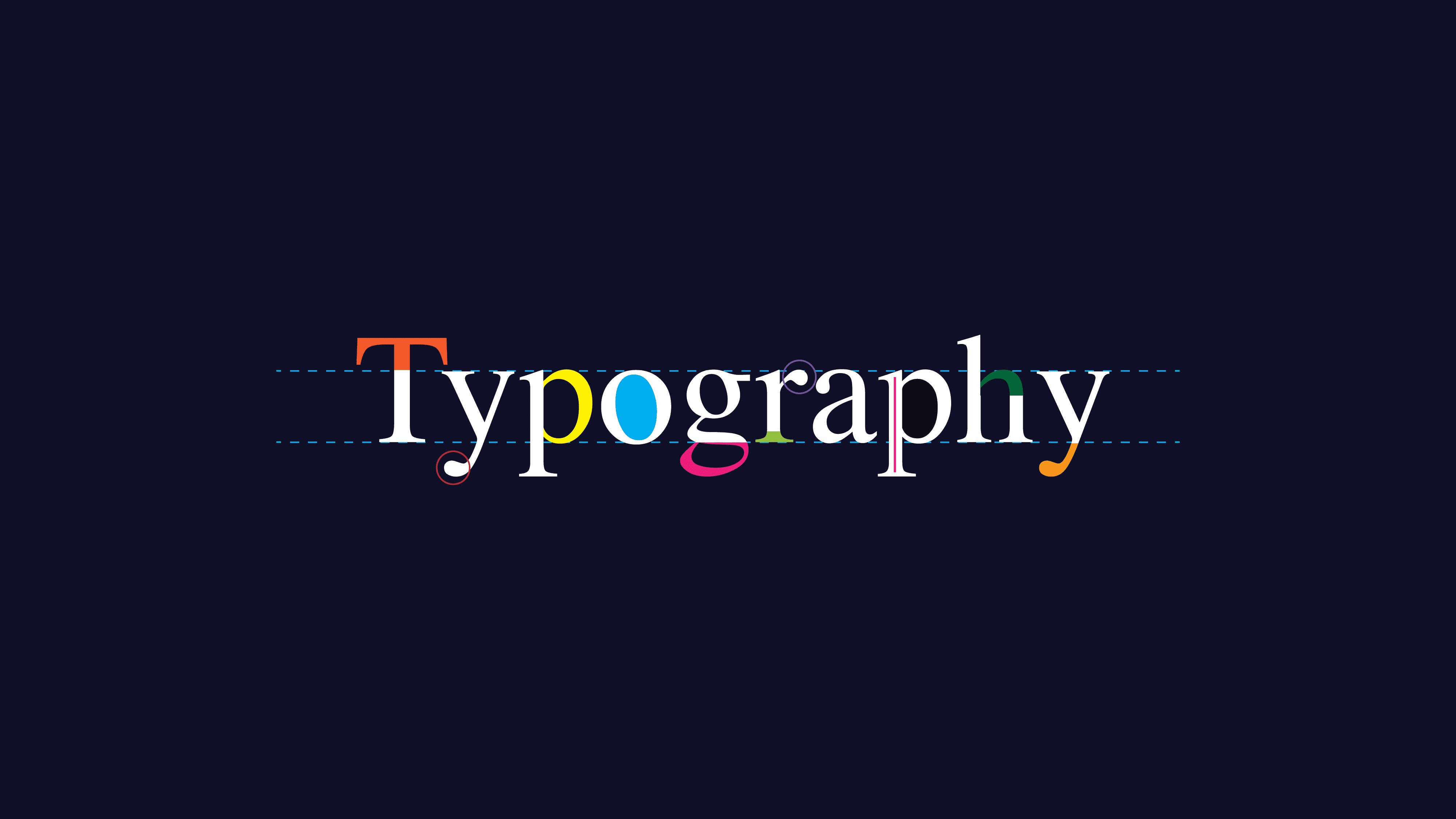
Understanding the Essence of Typeface
Typography is an art form in itself. At its core lies the typeface. It’s more than just letters. Typeface is where art meets function. It conveys emotion, style, and brand identity.
Typeface vs. Font
Many confuse typeface with font. Typeface is the design. Font is the implementation. Think of typeface as a song, and a font as its performance. They are connected but distinct.
Why Typeface Matters
Every letter tells a story. A well-chosen typeface can elevate design. It grabs attention and evokes feelings. Whether it’s bold like Helvetica or elegant like Times New Roman, each has its place.
How to Choose a Typeface
Consider your message. What feeling do you want to convey? Look at readability. Is it clear and easy to read? Consider versatility. Can it adapt to different contexts?
The Role of TypeType in Modern Design
TypeType is a brand that excels in combining style and function. Their typefaces are modern yet timeless. They offer a wide variety of styles. Each caters to a unique audience and purpose.
The Popularity of TypeType
TypeType has gained a loyal following. Designers love their innovative styles. Their success lies in their attention to detail. Each typeface is crafted with precision and care.
How Typography Enthusiasts Can Benefit
Typography enthusiasts can learn much from TypeType. Explore their offerings. Try different typefaces in your projects. Notice how it transforms the look and feel.
The Anatomy of a Typeface
Understanding typeface anatomy is crucial. It’s more than just letters. Each component plays a vital role. Let’s break it down.
Serifs and Sans-Serifs
Serifs are small lines attached to the end of strokes. They add elegance and tradition. Sans-serifs, without these lines, offer a clean, modern look.
How to Use Serifs
Serifs are great for formal designs. They work well in print media. Books and newspapers often use them. They add a classic touch.
Why Choose Sans-Serifs
Sans-serifs are versatile. They’re suitable for digital platforms. Websites and apps often use them. They offer a sleek, contemporary feel.
Kerning and Leading
Kerning is the space between characters. It’s crucial for balance. Leading refers to the space between lines. Both affect readability and design flow.
Tips for Effective Kerning
Adjust kerning to enhance legibility. Avoid too much or too little space. Experiment with different settings.
Mastering Leading
Leading affects how text is read. Too tight can be hard to read. Too loose can seem disjointed. Find the right balance.
Exploring Typeface Families
Typeface families contain various styles. Each style serves a purpose. Bold, italic, and light are common types. They offer flexibility in design.
The Significance of Typeface Families
Typeface families provide consistency. They maintain brand identity. Use different styles within the family for emphasis.
Choosing Styles Within Families
Select styles that fit your message. Bold for emphasis. Italic for subtlety. Light for elegance.
Experimenting with Typeface Families
Don’t be afraid to mix styles. Create hierarchy and interest. Ensure they complement each other.
Conclusion
Typography enthusiasts know the power of typeface. It’s more than just letters; it’s a tool for expression. Brands like TypeType exemplify this art. Explore their typefaces. Discover the impact of typeface on design. Remember, every letter counts.
Keep an eye for more news & updates on Buzz Slash!


