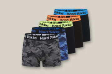
In the dynamic world of fashion retail, the accuracy of product colors in catalog images can significantly influence consumer perception and buying decisions. As online shopping continues to dominate the retail landscape, the need for precise color representation in fashion photography retouching has never been more critical. This article explores the importance of color consistency, the challenges involved, and the best practices for achieving true-to-life colors in fashion catalog images.
The Importance of Color Matching in Fashion Catalogs
Color consistency is pivotal in fashion photo editing because it ensures that the colors customers see on their screens are as close as possible to the actual products. Inaccurate color representation can lead to customer dissatisfaction, increased return rates, and a tarnished brand image. For instance, imagine a scenario where a shopper orders a dress in what appears to be a vibrant shade of red on their device, only to receive a product that is actually a duller shade. The likelihood of disappointment and product return is high, which not only affects the direct revenue but also impacts customer trust and loyalty.
Moreover, maintaining color consistency across various items enhances the visual appeal of a fashion line, creating a cohesive look that can strengthen brand identity. This consistency helps in building a reliable and professional image that customers can trust.
Challenges in Achieving Color Accuracy
Achieving color accuracy in clothing photo editing is fraught with challenges. Different fabrics reflect light differently, which can alter perceptions of color. Additionally, lighting conditions during photoshoots can affect how colors appear in photographs. For example, fluorescent lighting can cast a cool blue tone on products, while incandescent lighting tends to bring out warmer tones.
Another significant challenge is the digital medium itself. Different devices and screens display colors differently due to varying display technologies and settings. This variability makes it difficult to ensure that all potential customers see the same color.
Methods for Maintaining Brand Color Standards
To overcome these challenges, fashion brands and photographers must adopt meticulous methods to ensure color accuracy:
1. Standardized Lighting Conditions
Consistent lighting is crucial for accurate color representation. Using standardized lighting setups during photoshoots can help maintain color consistency across different products. It’s advisable to use natural light or high-quality studio lights that mimic natural light to minimize color distortion.
2. Color Calibration
Color calibration of monitors and output devices ensures that the colors in the editing process match the final product. Tools like colorimeters and spectrophotometers are essential for calibrating devices to achieve consistent color outputs.
3. Use of Color Reference Charts
Including a color reference chart during shoots can help in post-production by providing a benchmark for color correction. This practice helps editors adjust the colors in fashion image editing software to match the true colors of the clothing items.
Tools and Techniques for Achieving Consistent Whites and Neutrals
Whites and neutrals are particularly tricky to get right because they can easily pick up colors from their surroundings. Techniques such as:
- Using a Grey Card: This helps in achieving the correct white balance during the shoot, which can be fine-tuned during the fashion photo editing process.
- Selective Color Adjustment: Tools like Photoshop offer selective color adjustment layers that help in tweaking the whites and neutrals without affecting other colors.
Handling Different Fabric Textures and Lighting Conditions
Different fabric textures react differently to light, and understanding this behavior is key to accurate color reproduction. For instance, shiny fabrics like satin might reflect more light, leading to overexposed spots, while matte fabrics like cotton absorb more light, appearing darker in photos.
To manage these variations, fashion photography retouching professionals use techniques such as:
- HDR (High Dynamic Range) Imaging: This technique combines multiple exposures of the same shot to create a balanced image where the textures and colors are accurately represented.
- Manual Color Correction: Skilled editors manually adjust colors in areas affected by shadows or highlights to ensure consistency across different parts of the fabric.
Conclusion
In conclusion, mastering product color accuracy in fashion catalog retouching is not just about using advanced tools, but also about understanding the science of colors and light. By implementing standardized practices for lighting, using color calibration tools, and employing advanced fashion image editing techniques, brands can significantly enhance the online shopping experience. This not only reduces returns due to color discrepancies but also builds a loyal customer base that trusts in the color accuracy of your fashion products.
Achieving color consistency is an ongoing process that involves attention to detail and a deep understanding of both technology and consumer expectations. By prioritizing color accuracy, fashion brands can stand out in a crowded market and deliver a customer experience that is both satisfying and visually delightful.
Keep an eye for more latest news & updates on Buzz Slash!


